
How many times have you made a list of things that would make you feel better, and then not read it once on any of the evenings you needed it?
Mine hung on the fridge for four months. Good handwriting, nice pen, seventeen ideas. I know it was seventeen because I counted them when I finally took it down. What I don’t know is why it never got used, except that every time I stood in front of it at nine in the evening, it read like a menu in a language I’d stopped speaking.
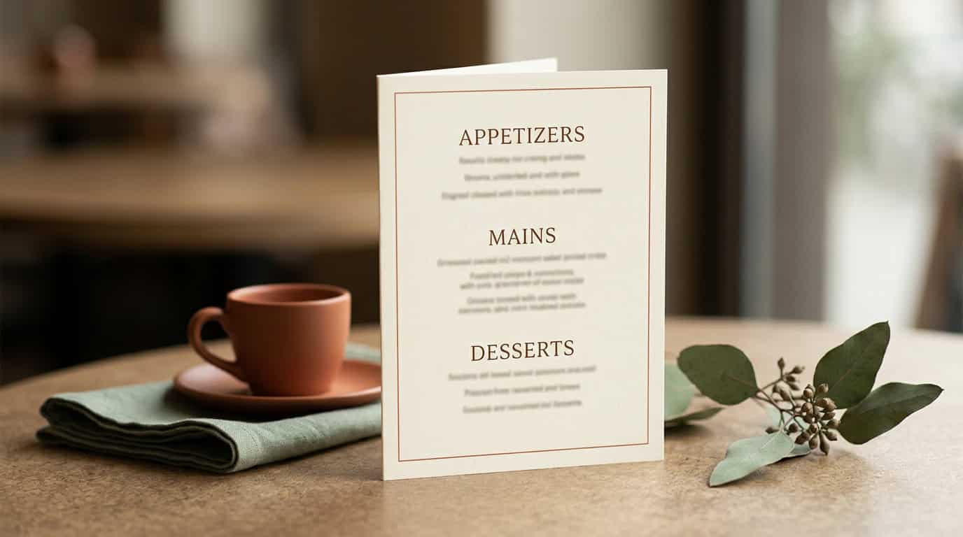
The second version worked, and it turned into the dopamine menu canva template I still use. Same menu sections everyone uses (appetizers, mains, desserts) but with two rules the usual version doesn’t have, and one column read completely differently. The free download covers those three. This post covers all five, because two of them only start to matter on the weeks that go sideways.
The 20-Second Version
- A dopamine menu is a set of options you decided on in advance, for the moments when working out what might help is itself too much work.
- Sections are sorted by what each thing costs you to start, not by mood.
- Two items per column. The cap is the point.
- Write it on a good day. Read it on a flat one.
If the term is new to you, start with what a dopamine menu actually is and come back. The rest of this is the form itself.
The Five Columns, and What They’re Sorted By
Most menus you’ll find are sorted by mood. Calming things here, energising things there. That sounds sensible and it’s exactly why mine sat on the fridge unread: on the evenings you need the thing, you can’t tell what mood you’re in, and you certainly can’t sort by one.
So this one sorts by what it costs you to start: time, effort, whether you have to put shoes on, what it takes from the rest of the evening.
- Appetizers: five minutes or less. Standing up counts. Opening a window counts. This column exists for the evenings where the rest are theoretical.
- Mains: a real block of time, but one you can stop in the middle of without losing anything. (In the planner these are the entrées, fifteen to sixty minutes.)
- Desserts: use sparingly. More on this one in a minute. It’s the column people misread, and it’s the one that makes the others get used.
- Sides: things you can do alongside something else. The cost isn’t time, it’s attention, and it’s lower than it looks. This one isn’t in the free version.
- Emergency snacks: for when there’s nothing left and appetizers already feel like a lot. Also not in the free version, and the one I’d add first.
One thing worth saying plainly, because most articles skip it: these aren’t categories that exclude each other. A walk can be an appetizer, a side and an emergency snack depending on the evening. They’re different ways of making the choice smaller, not a filing system. If something fits in two columns, put it in the one where you’ll go looking for it.
There’s a longer breakdown of why these sections hold across a whole week if you want the reasoning. For filling in the form, the short version is enough: you’re not deciding what you’d like. You’re deciding what’s reachable.
The Two-Item Rule
Two per column. The template won’t stop you writing five. This is a rule you bring to it, and it’s the one that decides whether the thing gets read again.
To be clear about where it comes from: two isn’t a magic number and I’m not aware of any research that says it is. It’s a design decision, and the reason is boring: the whole job of the menu is to make the choice smaller, so a menu that grows is a menu working against itself.
Here’s what I’ve noticed, and it took me embarrassingly long. A long list of good options isn’t more choice, it’s less. Somewhere past about three, the list stops being a shortcut and becomes another decision to make, at the exact moment you have nothing left to decide with. Seventeen ideas on the fridge was seventeen small negotiations. Two per column is a glance.
There’s a decent side effect to holding yourself to two: the aspirational entries fall out on their own. Nobody puts “learn Portuguese” in a two-slot column. Which is the other half of the rule: nothing you think you should enjoy. If it’s there because it sounds like the kind of thing a well-rested person does, it’ll sit untouched and quietly make the rest of the page feel like homework. Out it goes. Some starting points, if the boxes are staying empty.
Desserts: The Column Everyone Misreads
On most menus desserts are the treat list, the nice reward at the end. On this one they’re something else entirely, and it’s the single change that made mine start working.
Desserts are the things that give you an immediate lift and then take the rest of the evening with them: the scroll, the third episode, the browser tab with the shopping basket in it, the deep-dive into something you’ll have forgotten by Thursday. They work. That’s the whole difficulty. They just charge you afterwards, in time you’d planned to spend on something else.
Most people fill this column with things they’d be happy to admit to. And then the real ones win anyway, every single time, because they’re the only options that don’t need to be remembered. They’re already open on the phone in your hand.
Writing them down honestly changes something small and useful. They stop being the thing that happens to you and become one column among the rest, with a cost written next to it. I still pick desserts some evenings. The difference is that I pick it, I know roughly what I’m spending, and about half the time I look at it and go to appetizers instead, because standing outside for two minutes is free.
That’s the whole reason the other columns ever get touched.
How to Fill Out the Dopamine Menu Canva Template
- Fill it in on a good-energy day. Not on the evening you need it. More on why that matters below.
- Two per column. Stop there even when a third one is obviously good.
- Nothing you think you should enjoy. Only things you’d genuinely reach for.
- Desserts is not a treat list. Write down what you already reach for automatically, including the unflattering ones.
- Put it where you stall. Which is almost never the kitchen.
On step one: a dopamine menu written on a bad evening will be full of things that sound like penance, because that’s what everything sounds like on a bad evening. Write it on a Saturday morning with coffee, when generating a handful of pleasant options is nearly effortless. That version of you is doing the sorting for the version who can’t. Same principle as deciding what a rest day holds before you’re having one. The decision gets made once, early, while it’s cheap.
Where It Hangs
Not the fridge. I say that with the confidence of someone who lost four months to the fridge.
The menu goes where you stall, and for most people that isn’t the kitchen. It’s the sofa, the end of the desk, the inside of a cupboard door you open when you’re avoiding something. Somewhere your eye lands when you’ve run out of plan. If you’re not sure where that is, notice where you’re standing the next time you pick up your phone without deciding to.
Since the template is a Canva file, you get two options and they’re not equivalent. On your phone it’s always with you and never in front of you. Printed and stuck somewhere physical, it interrupts the moment you actually stall. Do both if you like, but the printed one is the one that works. Colour coding per column is optional, genuinely useful, and also a very effective way to spend an evening not filling in the menu.
Redo it every couple of months. Not because there’s a rule about it, but because the mains column goes stale faster than you’d think, and a menu with three dead items on it stops being trustworthy.
Get the Free Dopamine Menu Canva Template
The free version is a Canva template with the three columns you’ll use most. Duplicate it, type straight into it, change the colours if you want, print it or keep it on your phone. Yours to keep and edit forever.
| Column | What goes in it | Free template |
|---|---|---|
| Appetizers | five minutes or less | ✅ |
| Mains | a block of time you can stop in the middle of | ✅ |
| Desserts | immediate lift, charges you later | ✅ |
| Sides | alongside something else | planner only |
| Emergency snacks | when appetizers already feel like a lot | planner only |
Drop your name and email on the next page and the Canva link lands in your inbox. That’s the whole process: no course, no funnel, and you can unsubscribe the same day if you only came for the sheet.
It’s Tuesday, about half nine. You’ve closed the laptop and you’re standing in the doorway of the living room doing nothing in particular, which is how these evenings usually start. There’s a sheet of paper on the cupboard door with six things on it and a cost next to each one. You read four of them. You go and stand outside for two minutes.
No transformation. Just a decision that was already made, back on a Saturday, by someone with more to spend.
The free sheet handles a normal evening. The two columns it doesn’t have are the ones that matter on a bad week: sides, for when nothing gets its own slot and something has to run alongside the washing up, and emergency snacks, for the evenings where a five-minute appetizer is already too much. Both are on the dopamine menu spread on pages 8 and 9 of the Flowers ADHD Planner, where it sits next to a weekly energy check, a to-do box capped at five lines rather than twenty-five, and brain dump space you don’t have to find a page for. Undated, so there’s no January to miss.
Start with the free one. If you get to the week where three columns aren’t enough, you’ll know which two you’re missing.
Designed in Europe. Made for brains that don’t fit neat boxes.
Pink Lobster Creatives is run by Liesbeth, a surface pattern designer building the tools she wished she’d had 10 years ago. Everything here comes from lived experience rather than a medical qualification. Nothing on this blog is a substitute for advice from your doctor, therapist, or ADHD coach. Strategies that work for one person with ADHD may not work for another. If something resonates, take it. If it doesn’t, leave it.
Leave a Reply