
Some links in this post are affiliate links. If you buy through them I get a small commission, at no extra cost to you. I only link to tools or books I actually use or have used. The planner is mine, that’s the main thing this site exists for.
It’s Tuesday at 3pm. The dopamine menu is on the desk. Twenty-three items on it — some good ideas from Sunday-you, all in your handwriting, all equally reachable, all sitting in the same visual grey soup.
You look at the list. You cannot see anything.
The information is there. The reading brain is offline. And the very moment the menu was supposed to help — the exact 3pm dip it was designed for — is the moment the menu becomes least useful, because reading a 23-item list is now the tax you were trying to avoid.
There’s a fix that takes five minutes and a set of pastel highlighters.
The short version
A color-coded dopamine menu turns a 3pm decision into a 3-second glance. Five pastel highlighters, one color per category, mark the menu so the eye finds “the category I haven’t touched today” without reading a single word. Five minutes to set up. Works on paper. No app, no system to maintain.
Why color-coding solves the 3pm menu problem
The dopamine menu itself is a solid tool. Five categories that mix high-and-low energy, covering the range from a 60-second reset to a future-self treat — that’s the structure that makes the menu hold across a week.
The problem is not the categories. The problem is that at 3pm, when the menu is actually needed, the reading brain has clocked out.
Many people with ADHD find visual cues easier to process than long blocks of text, especially when mentally fatigued. A page of handwritten items — even good items, even the same list you loved on Sunday — becomes a wall of grey text under 3pm conditions. The activation cost of “read the list, choose one item” competes with the activation cost of “scroll Instagram.” For many people, Instagram usually wins.
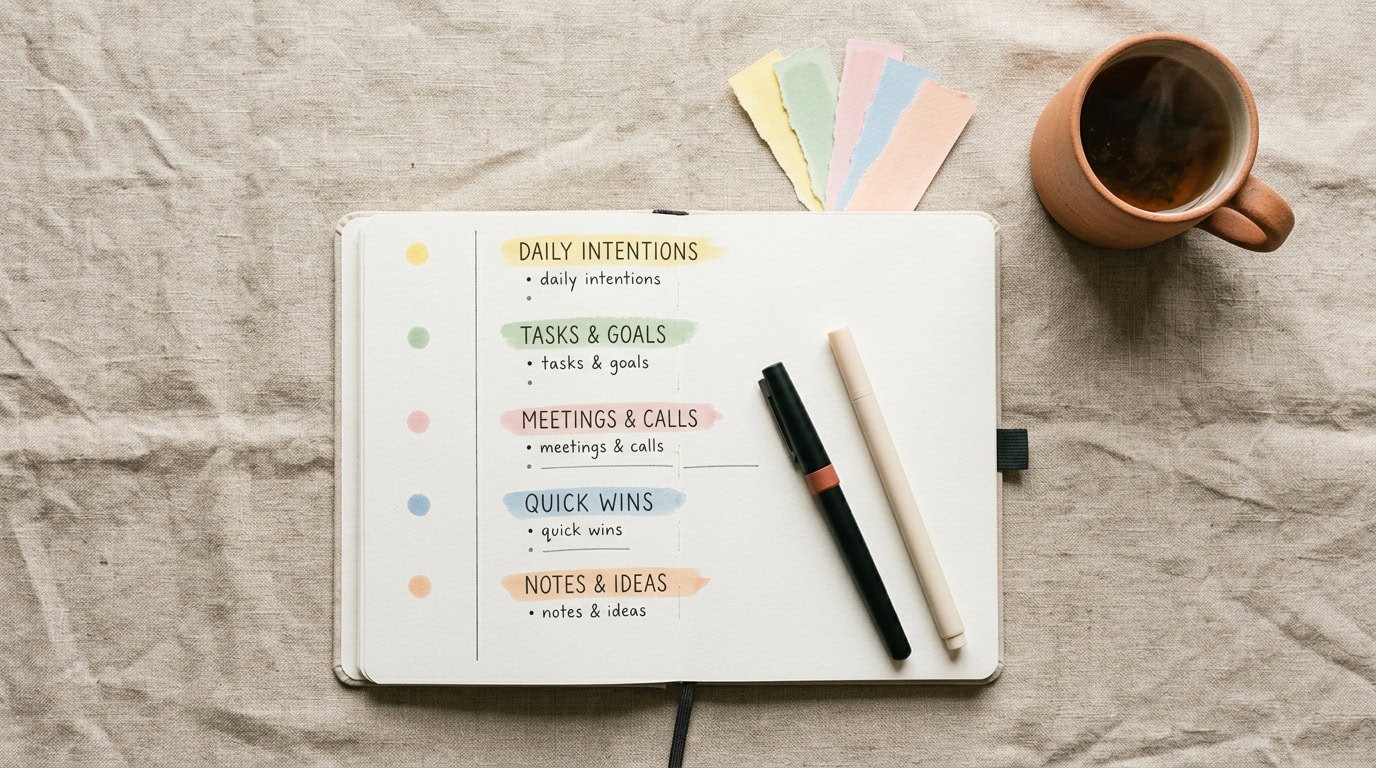
Color changes the mechanic. For many people, color tends to be noticed before the individual words on a page. A menu with five distinct colors becomes a map: yellow = quick resets, green = movement, pink = sensory, blue = connection, peach = future-self. The color can narrow the options before you have to consciously read every item.
The menu goes from “a list to work through” to “an object to glance at.” That’s the shift.
The 5-color system
Five categories, five pastel colors. Every item on the menu gets a small color-swipe of its category’s color — either as a highlighted bullet, a colored margin bar, or a small color-dot at the end of the line. Consistency matters more than which specific color goes with which category.
Here’s the mapping that works for the Flowers ADHD Planner palette:
- Yellow — Quick resets. 60 seconds, under-the-radar reward. The category most likely to get used at 3pm, so yellow lands on the fastest-to-scan color for a reason.
- Green — Body movement. 30 seconds of anything. Green reads as “go somewhere” without shouting.
- Pink — Sensory pleasures. Candles, fuzzy socks, a specific mug, a soft hoodie. Pink signals warmth and texture at a glance.
- Blue — Connection. One voicenote, one meme text, one 8-minute call. Blue calms without competing with the sensory-pink.
- Peach — Future-self treats. Filling the water bottle, laying out tomorrow’s clothes, charging the headphones now. Peach reads as gentle care.
If a different mapping resonates — swap it. What matters is that the map is consistent across the whole menu and matches the palette of whatever planner or notebook the menu lives in. A yellow that fights the paper colour is a yellow that gets ignored.
Which highlighters and why
Not every highlighter works for daily use. Neon yellow on cream paper looks great in a photo, less great on a planner page you’ll look at four times a day for a month. The ones that hold up are pastel, muted, and forgiving of the paper underneath.
The set on my desk: Stabilo Boss pastel highlighters. Six colors, all soft, all readable, none of them shouting.
I bought these highlighters myself and wasn’t paid or sponsored to mention them.
What makes this specific set work for a color-coded ADHD menu:
- The pastel range is easier on the eye than the neon version. A menu you check three times a day at low battery does not need to be visually loud. Pastel gives you the color-signal without the eye-fatigue.
- The colors match a warm palette. No clinical primaries, no classroom yellow. They sit next to cream paper without fighting it.
- I haven’t experienced noticeable bleed-through on most planner paper. Important if your dopamine menu lives on the same spread as your brain dump.
- In my experience, they seem to dry out less quickly than other highlighters I’ve used. A highlighter that dries out in six weeks becomes a friction point the next time you go to add a category.
Six colors in the set, five categories in the menu — one color spare for something else, or for a “high-priority” mark on a single item. I use the spare (lilac) to mark the one item from any category that’s been on the menu three weeks without getting picked. That item is either the wrong item, or the item that’s asking for a bigger conversation. Either way, lilac catches it.
How to set it up in 5 minutes
Open the dopamine menu page. Put the highlighters within reach. Set a timer for 5 minutes, so this doesn’t become a whole afternoon of pretty-planner theater instead of the small utility move it is.
1. Colour the category headers first (60 seconds). Each of the five category titles gets a swipe of its category’s color. If the menu has good visual hierarchy already, this step alone is often enough.
2. Mark the bullets or item-margins (2 minutes). A small colored dot next to each item, or a thin colored bar in the left margin. Do the whole page. Speed matters more than perfection — the goal is a scannable map, not a coloring project.
3. Add a tiny color key at the top or bottom of the page (30 seconds). Five little colored squares with the category names next to them. This is only for the first week — after that, the eye already knows what each color means.
4. Put the highlighters somewhere reachable, not somewhere aesthetic (30 seconds). In a drawer with fifteen other pens is not reachable. On the desk, next to the planner, where you’d have to move them to open the laptop, is reachable.
5. Test it Tuesday at 3pm. Look at the menu without reading it. Notice what color is least represented in your day. Pick from that color. The whole reason for the system.
Total time: five minutes. The menu is now a map instead of a wall of text.
What color-coding doesn’t fix
Color-coding sorts the menu. It doesn’t create motivation, and it doesn’t build the menu itself — you still need the five categories that hold across an ADHD week as the underlying structure. Color on top of a menu that only contains “quick resets” won’t help. Color on top of a menu where every item secretly takes 20 minutes won’t help either. The menu items themselves have to be genuinely reachable.
Color also doesn’t fix the days when the whole system is the wrong move. If the menu itself isn’t the answer — if what’s needed is rest, or a 90-second reset, or a walk that’s not on any list — a color-coded menu is just a well-organized page you’re not going to use today. That’s fine. The menu doesn’t have to be the answer every day to be worth having.
And color-coding doesn’t survive if the highlighters aren’t reachable. This sounds trivial. It isn’t. When you’re low on energy, even opening a drawer can become enough friction to stop the habit.
How the planner holds this
The Flowers ADHD Planner has the dopamine menu built into the spread on pages 8 and 9, with each of the five categories pre-structured. The color-coded version lives on that same spread — five colored dots down the margin of each category, one small color-key at the corner of page 9, and the highlighters stored next to the planner on the desk.
The Energy Check at the start of each week can give you a clue about which categories you may need more that week. A low-battery week often calls for more yellow and pink (quick resets, sensory). A high-focus week can carry more green and blue (movement, connection). Peach — future-self treats — is the color that’s easy to skip and often worth stocking, because it’s the one that changes the next day.
Undated. Designed in Europe. Made for brains that need the menu to be scannable before it’s readable.
Pink Lobster Creatives is run by Liesbeth, a surface pattern designer building the tools she wished she’d had 10 years ago. Everything here comes from lived experience rather than a medical qualification. Nothing on this blog is a substitute for advice from your doctor, therapist, or ADHD coach. Strategies that work for one person with ADHD may not work for another. If something resonates, take it. If it doesn’t, leave it.
Related reads
5 Dopamine Menu Categories That Actually Work for ADHD
4 Brain Dump Rules That Actually Stick
The 90-Second Reset for ADHD — When the Freeze Hits
5 Books That Reframed How I See ADHD
Leave a Reply